
Here are more photos of the formerly black demon.


Here are more of the white primered demon.
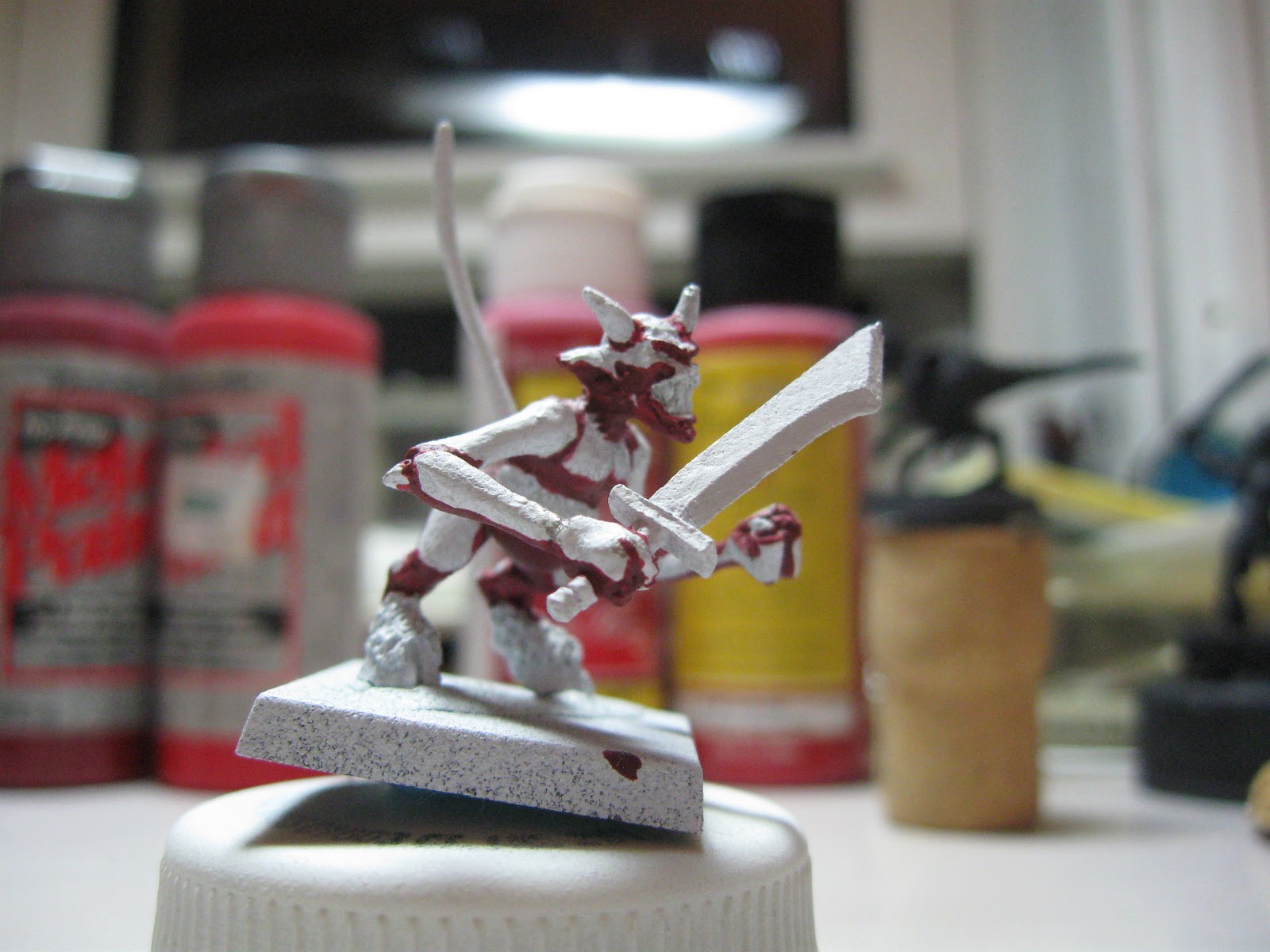


These photos and the ones from the last post can all be found in the picasa album.
 I’ve begun reinvesting my time into painting miniatures. The first thing I wanted to relearn and understand how to paint red.
 Red is one of the most difficult colors to paint. The reason is because the pigments used in red break down quickly when it is diluted causing it to cover poorly. This can cause red to be very thin, almost translucent. Translucent paint results in needing multiple layers and that means taking a lot more time to paint. There are a few other pitfalls like over highlighting and ending up with something that is more orange than red or over-shading/under highlighting resulting in muddy brown or purple paint.
 |
| http://www.jenovapainting.blogspot.com/ |
 |
| http://www.jenovapainting.blogspot.com/ |
 This first set of paints is the red from the Americana and Anita’s Craft lines. The order of colors is Calico Red, Nappa Red, and Cranberry red from American. The final two are Anita’s Rust Red and Raspberry Red. My experience with Americana has been that they are a decent paint for the money with the ability to maintain acceptable coverage after being thinned. I’ve not used them for many light colors but their white’s can get very chalky fast. Anita’s paints have provided me with several coverage issues in the past once thinned and while I did not thin these samples I suspect they will give me the same trouble I have consistently had with them.
 This second set is also a set of craft paints. These are DecoArtMetal paints Deep Red and Reel Red. The last two are Apple Barrel Berry Red and Color Traditions Tomato Red. The DecoArt Metal paints have generally provided a strong coverage, however they can also get very “gloopy’, a technical term I know, when that happens they do not always thin easily or well. The Apple Barrel paints have generally been inexpensive, I’ve used them but they do often thin quickly reducing coverage. Color Traditions are a brand that I have little no experience with.

 Another set of paint options are Games Workshop and Valejo’s Model Color paint lines. The associated image has GW Red Gore as the first sample. Valejo Flat Red, Brown Rose, and Violet Red are the remaining samples. The Games Workshop paints have always felt very thick and likely to obscure detail even when thinned but that could just be me given how long GW has been making and selling paint. Valejo’s paints have always flowed more than I like them to, but what that causes in a lack of control has been made up by their ability to from good glazes.
 Finally I present a triad of Reaper Master Series Red Brick, Deep Red, Blood Red. The Master Series is my default paint line because of the triad system providing a base, highlight, and shadow. I’ve had varying experiences with them being either too thick or too runny but overall they provide solid coverage. Unfortunately I do not think the purple tones that this triad has will be right for the affect I am hoping to achieve, so I will not be able to use all of it.
